What I learned by doing my simple personal project

In September, I wanted to try something new, so I started a simple project to check my abilities in UX and front-end development. The idea was simple — create customizable, reusable and highly accessible buttons. I have experience with front-end but I usually use CSS frameworks like Bootstrap or Foundation. But not now. I decided to design the whole page completely from scratch.
This post was originally published on Medium platform. You can see the former version directly in medium.com.
The final project is hosted on Github pages. Click on the link below if you want to explore this project. Check the Playground page and play with many variants of buttons!
The Buttons Project – Project of highly accessible and customizable buttons
Are you a front-end developer? Feel free to review my code on Github!
Before I started, I tried to answer these questions:
- Why do I want to do it?
- Why buttons and not something else instead?
- How can I customize these buttons?
- How can I ensure accessibility?
- How should I start?
My answers are below…
Why do I want to do it?
For learning purposes. Simple. It’s a kind of test for myself. I can say that something is pretty or ugly but I can’t rate my own work. And it’s a great opportunity to try something new (in my case I throw away LESS in favor of SASS).
Why buttons and not something else instead?
I looked for a simple element which has a lot of variants, states, possibilities and use cases. Buttons are omnipresent and they are used on every website.
How can I customize these buttons?
I wanted to change many properties of my buttons without any extra line in CSS (SCSS in this case) files. I tried to list which parameters should be changeable. For each parameter, I wrote set of special CSS classes to change the final appearance.
This approach is followed by Bootstrap, Semantic UI, Foundation, and many other front-end frameworks. But it has one serious inconvenience — use HTML to describe, how the button looks like. It should be the CSS role. Instead, I have to change HTML if I want to change appearance. There is a big advantage — I can insert good-looking buttons on my site without any extra line of CSS.
How can I ensure accessibility?
That was a good question. I didn’t need this kind of functionality and I didn’t know what the problem is. So first I search something information about color blindness. Later on, I tried to emulate various kinds of color blindness to felt it. I had no idea how much this emulation reflects reality but I started to do something with it.
How should I start?
Usually, I start a project by defining dependencies and directory structure. In this case, I tried to keep everything as minimal as possible. I added just things which I was sure that I will use them. My first HTML element on the site was… button.
A month later I had finished and I had decided to publish my work. There are my conclusions about this “simple” project.
I was the victim of “new project” illusion
The idea for a new project is always great. The perspectives for doing creative and interesting things drive to start working as fast as possible, but when I started, an enthusiasm had disappeared when the first big problem appeared.
I questioned my original idea
Sometimes in my mind, a lot of random thoughts disturb me:
- “Is it necessary?”
- “Are you sure it is that what you should do now?”
- “It doesn’t make any sense…”
- “Nobody needs this.”
- “You don’t have enough skill to do this”
If you have similar thoughts, stop. Stop thinking in this way immediately. I had these thoughts too often but I knew what I had said at the beginning. I started this project because I wanted to train something. But I had another reason to continue working. I wanted to finish it because I had too many incomplete side projects on my mind or my hard drive. Truly, I was motivated by the answer for my first question (answer?) and willingness to complete this project. Because I did it for myself.
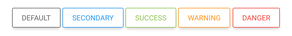
Many states = many problems with presentation
Designing a button which shows all its states properly is hard. We can’t freely design physical button’s state. In HTML, we have a few states to visualize (normal, hover, active, focus, visited). Each of them should look different to recognize which state is currently in use.
I tried to change hue, colors, and shadows to make state transitions similar to that physical buttons have. I am satisfied with the final effect but I try to find another, maybe better settings.
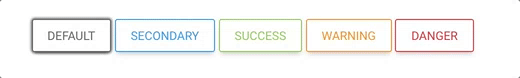
A Million colors, none of them was suitable
Colors are meaningful. It’s impossible to change the meaning of some colors e.g. red or green. We know that green color used to mean that something good happens. Appropriately, the red color usually means that something danger happened or will happen. The appearance of buttons is determined by colors and style. For me, it was the worst thing to do in this project, because I am a programmer, not a designer.
I said colors are meaningful. What happens if some (or all) colors disappear? It is an inconvenient situation for people with color vision deficiency (CVD). So, if a color doesn’t work as we expect, what else can take responsibility for giving a meaning?
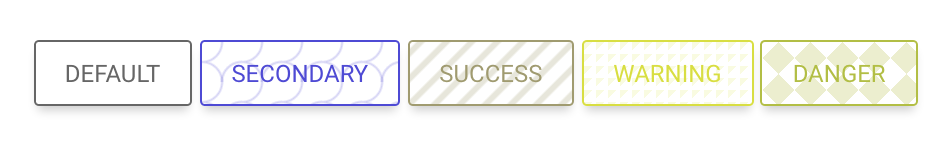
The answer is a pattern. If we add a specific pattern to buttons with the same meaning, they still meaningful even without colors. Seems good, but how design these patterns? To be honest, I found some examples of CSS patterns and I have applied it to buttons. I haven’t done any research but in my opinion, it will be helpful.
Toolset changes dynamically
I started the project with simple Gulpfile and a few files of HTML and SCSS. Later I added nunjuck templating system but I quickly replaced them by AngularJS. It’s perfectly OK when you add or change tools to ease your work. Building the whole toolbox at the beginning doesn’t make much sense because sooner or later changes will need.

The problems arise during work. Get the right tool to solve each of them. Don’t use a hammer to everything.
I had too little time than I thought before
I had a plan to spend minimum two hours per day to push the project forward.
Not a chance.
In my case of course. I have a regular job, a private life, other hobbies which need my attention and time. Sometimes I have been done completely different things to prevent boredom. I had to change my approach to the project and I tried to do small steps every day. I defined my tasks to keep it as small as possible, so I was able to do each of them at once.
Conclusions
I know that the project which I have done is easy, small and “to-do in a few hours”. Although it wasn’t a technical challenge for me, I learned much non-technical stuff. I’m proud of myself that I did it. So, maybe you have any abandoned side project on your computer. Maybe is it a good time to refreshing it and finally finish it?
Enjoyed this post?